
GRADIENTS IN THE RISC OS 8-BIT PALETTE
This file and all the endless research and frustration with Paint that went with it is the sole creation of Martin Bazley.
Please email me at martin@bazleyfamily.co.uk if you especially approve, or if you'd like any clarifications or corrections made.
A smooth gradient is extremely difficult to achieve with very few colours. They are very useful things to know how to do, whether you want shading on some game graphics or you just want to make an icon look fancy. Normally you would use 256 colours for desktop icons. (Or I do, anyway.)
The trouble with the RISC OS 256 colour palette is that it is not very generous with bright colours. I have seen at least one game where the author made generous use of brightly coloured gradients using only 256 colours, and the results just didn't look right. The only true gradients that are achievable with 256 colours are, in general, subtle ones such as lavender or teal.
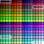
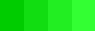
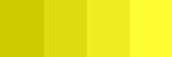
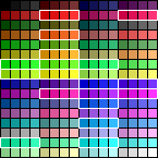
Take a good look at the commonly used gradient below. Does it look right?
No, it doesn't. And I'll tell you why. Because it isn't right. There are in fact colours from three separate gradients in there. The first four colours come from a lavender-coloured gradient, the second lot of four come from a violet gradient, and the last four do not have any colours in the same gradient in the palette at all.
The first four colours come from a 'gradient of order 3', meaning there are three lots of tints in that gradient - that's 12 colours, of which those form the first four. The second lot come from a 'gradient of order 2', meaning that there are two lots of tints in that gradient. The last four colours form a 'gradient of order 1' - in other words, they will never look right next to any other similar colours.


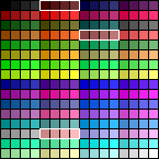
Much smoother, isn't it?
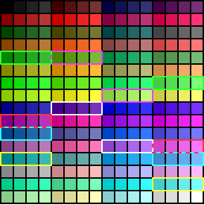
In the palette, there is a total of 1 gradient of order 4, 6 of order 3, 12 of order 2 and 18 of order 1. When you think about it, you've got a lot of choice - as long as you avoid the 'pure' colours (red, blue, green, yellow, magenta, cyan) because none of those have any corresponding tints as all.
You're not completely stuck, however. All of the gradients of order 3 are pretty close to those colours. So the main lesson is: if you're going to use gradients in the default 256 colour palette, keep it subtle!
Note that in some of the 'wrong' gradients pictured, you might have to look very closely to spot the discrepancies. A good way of making sure is to invert the colours in the pictures (you might be able to do this by highlighting them, I'm not sure). A 'wrong' gradient will return an even more obviously wrong result at the other end of the palette. (e.g. highlighting the 'wrong' green one will return three different shades of pink.) You can also get a similar (and very interesting) result by inverting the palette pictures.
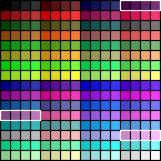
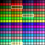
 Gradients of order 4
The only gradient of order 4 is one that should need no introduction to most people: it's the good old greyscale.
 (highlighted colours
form part of this gradient)
(highlighted colours
form part of this gradient)
This can be used just about anywhere. 16 shades of grey is about as much as most people will ever need, and it can't be confused with anything else.
![]()
![]()
![]() Gradients of order 3
Gradients of order 3 ![]()
![]()
![]()
Brown (Red)
The myth:

The facts:


The order 3 gradient colours:
Lavender (Blue)
The myth:
The facts:
The order 3 gradient colours:
Pink (Purple)
The myth:

The facts:


The order 3 gradient colours:
Green
The myth:

The facts:


The order 3 gradient colours:
Yellow
The myth:
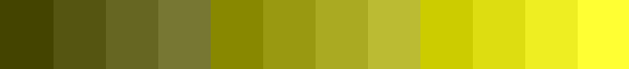
The facts:


The order 3 gradient colours:
Cyan
The myth:

The facts:


The order 3 gradient colours:
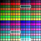
![]() Gradients of order 2
Gradients of order 2 ![]()
(colours highlighted with the same colour form a gradient of order 2)
(ditto)
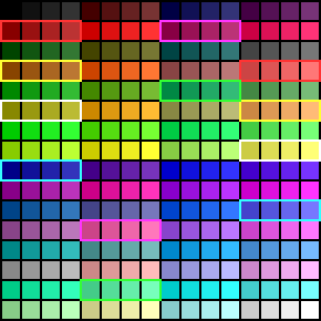
Gradient list:

|

|
| Peach | Fuschia |

|

|
| Wood | Green |

|

|
| Yellow-green | Cyan-green |

|

|
| Yellow | Blue |

|

|
| Violet | Magenta |

|

|
| Sky-blue | Cyan |
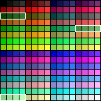
![]() Gradients of order 1
Gradients of order 1 ![]()
All highlighted colours in the palette have no corresponding tints. Note that this includes all of the 'pure' colours generated by (for RGB) only using 0 and 100 percent values or (for HSV) keeping saturation and value at 100%.
 <--------->
So what do you need to know this for?
Well, here's an example of how to apply gradient knowledge to something useful. I designed my own RISC OS window toolset using my knowledge of how the 8-bit gradients work. Here's what the 'back' icon looks like:


There are four distinct gradients in there. One of them, of course, is the greyscale. There is also some order 3 cyan in there. The sky-blue gradient of order 2 is used for the 'back' motif on the unpressed version, and the blue gradient of order 2 for the pressed one.
Of course, designing your own toolset is a simple example. 256 colour gradients are very useful things indeed - as long as you know which ones work.
BCNU
Martin Bazley 16/12/06